It’s 8 o’clock on an ordinary Monday morning. Overloaded with a much-needed cup of coffee, an umbrella, gym bag, and briefcase, you stumble into the elevator, muttering a grumbled greeting to your riding partner. Looking up, you realize your partner is none other than your idol. So now, you have to say something to them. Do you tell them how much you love their work? Do you introduce yourself? Ask for an autograph?
Ding. Too late. Your eight-second ride is up, your idol quietly exits the elevator, and you are left in the dust.
This unsuccessful attempt at making an impression epitomizes our eCommerce world today. This is a world in which a brand’s first (and probably only) encounter with a consumer has been reduced to eight seconds (or less). Eight seconds. Count that off in your head and you will realize how little time that truly is.
As a consumer, we are inundated with 5,000+ daily advertisements in a given day. And, it is nearly impossible to see, digest, and act upon each and every one of these. In fact, researchers believe 100 or fewer of these advertisements will form a unique impression, and whether we act on these 100 or so advertisements is up to us.
Let’s zoom in on one category of branded content in particular: the website. A brand’s website serves as both the introduction to the brand and a way to purchase its products. A successful website introduces the brand, convinces the shopper of its products’ importance, and, finally, converts the shopper into a customer.
One of the most important components to any website is its design. In fact, the first impression of a brand’s website is 94% design related. Furthermore, with users forming design opinions anywhere from 17-50 milliseconds, time is of the essence.
There are certain design decisions that helps to create higher conversion rates. Below is a list of eCommerce websites that are doing it right.
-
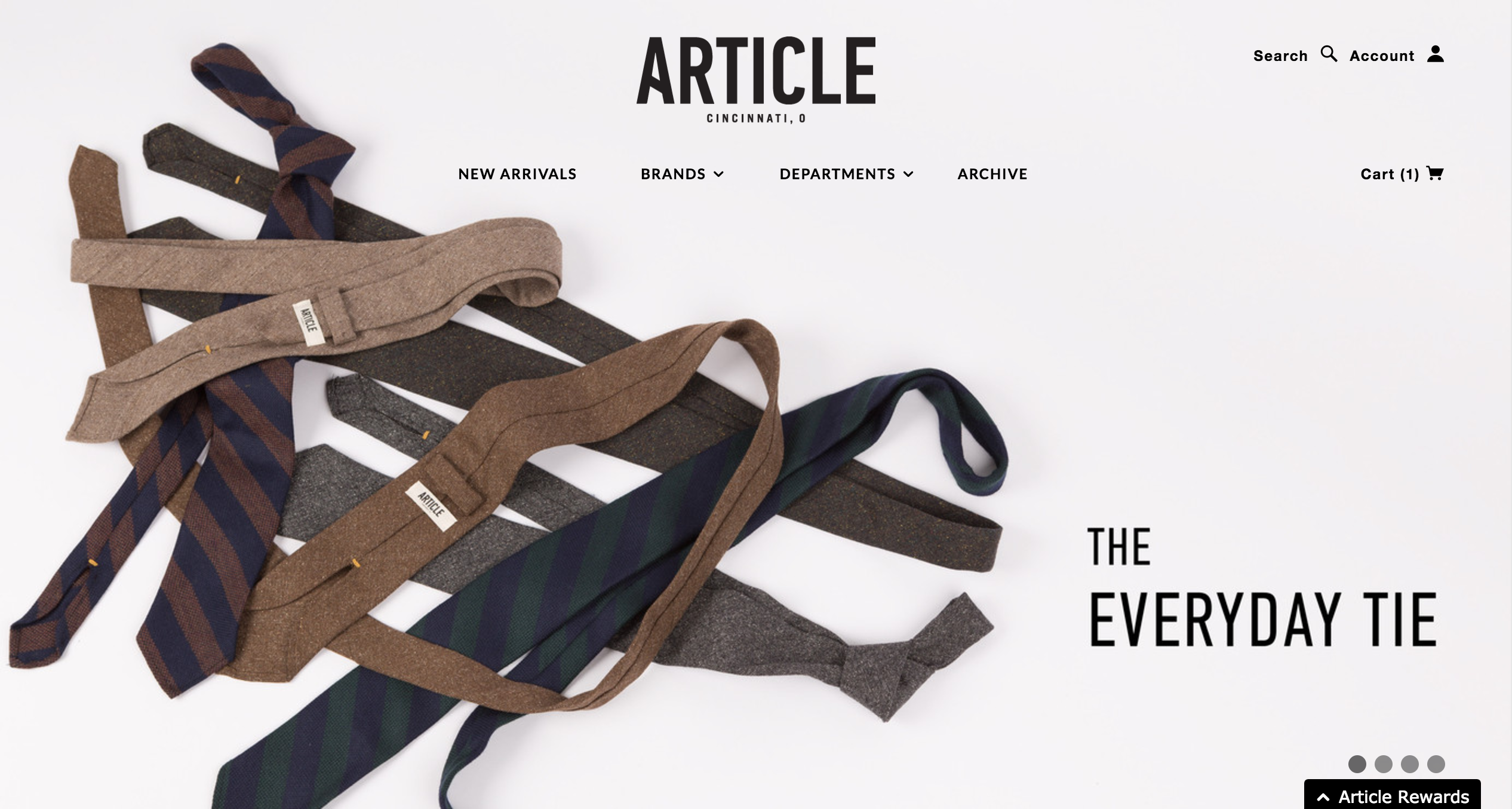
ARTICLE – A WHOLE LOT OF WHITE SPACE
This is minimalism at its finest. Without overwhelming the user with too many options, the folks at Article have opted to show the consumer only the most essential items. It is difficult to strike a balance between white space and content. However, this website design allows products the proper amount of breathing room, resulting in a greater opportunity for conversion.
-
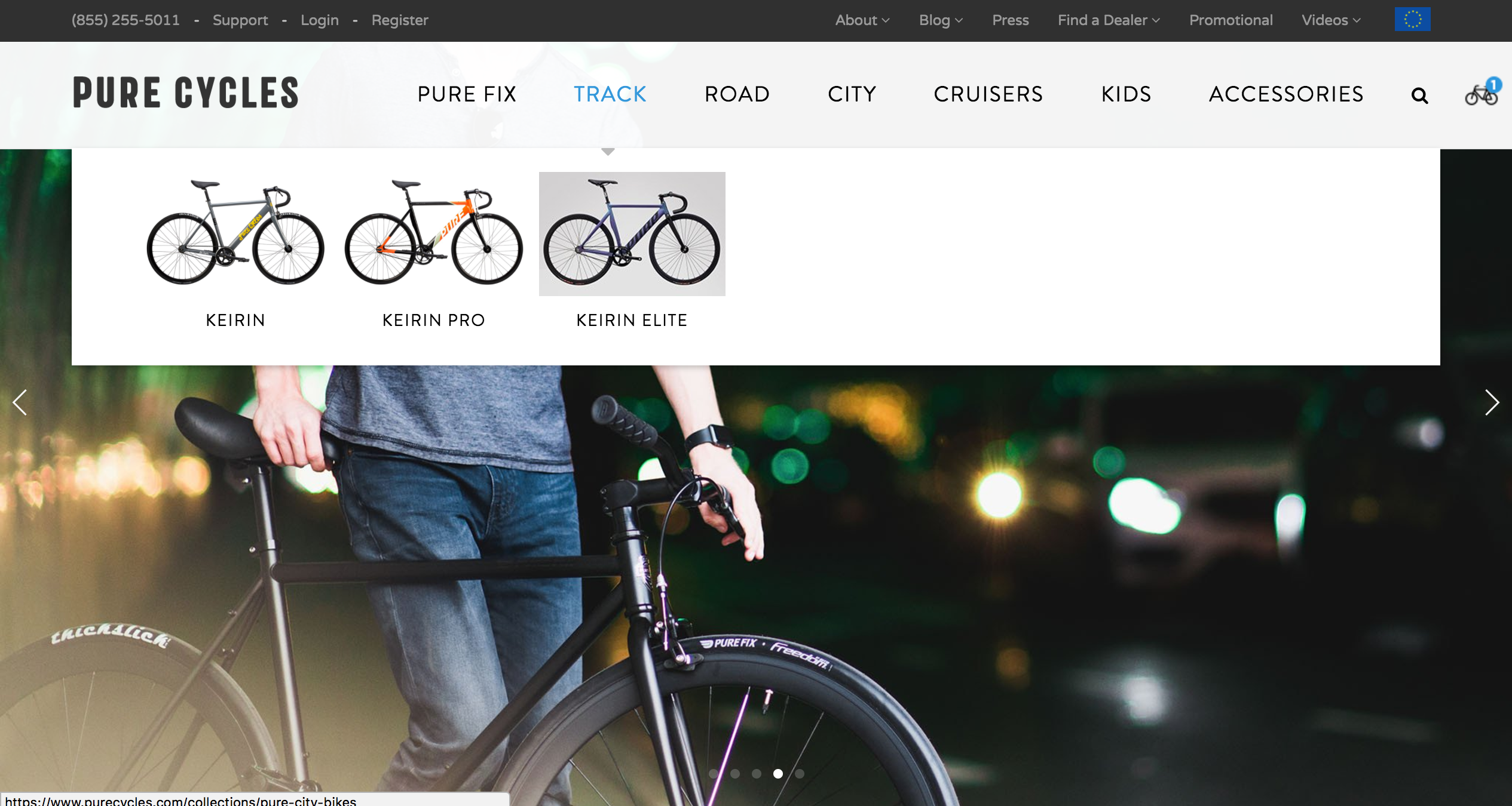
PURE CYCLES – THE GANG’S ALL HERE
The most essential elements in any eCommerce website is the logo, the navigation menu, the search box, the navigation utility links, and the site’s main image. This website includes all of these elements above the fold. Additionally, to ensure the consumer is not overwhelmed by all of the essential elements, Pure Cycles utilizes a contrast in colors and type to create some hierarchy between all of the elements. Finally, this website adds some intrigue with their beautiful lifestyle photography and their tasteful use of photography in the dropdown navigation menu.
-
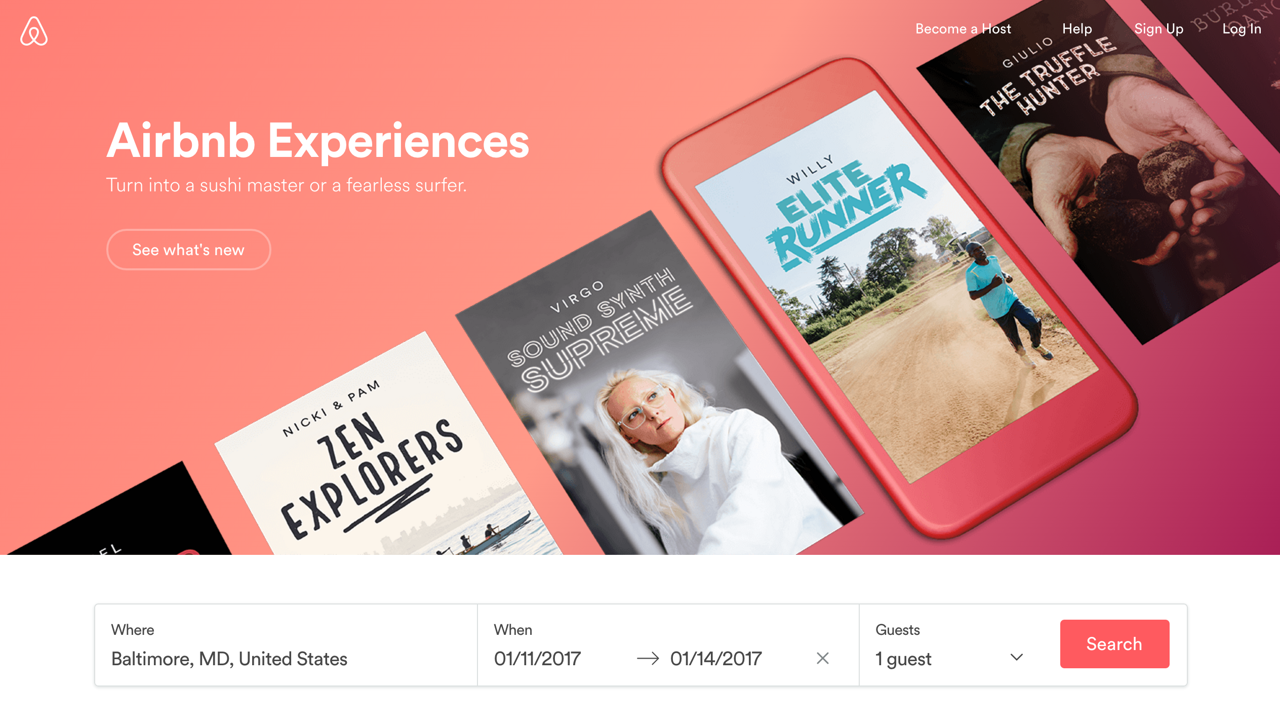
AIRBNB – ALWAYS A STEP AHEAD
It is important to be a step ahead of consumers. It is important to know what their next move is before they even know what it is. Airbnb is a shining example of this. Above the fold, their website design includes a strong hero image and navigation links. However, the most essential element is their dynamic search bar. This allows people to search for a place to stay right on the front page. This not only is convenient, but also it ensures a quicker path to purchase. Without this search bar on the homepage, some users may drop-off.
-
NORTH FACE – A CLEAR CTA
When creating a path to purchase, it is essential that you direct the consumer through the process. One essential way to do this is highlight a clear call-to-action. North Face is extremely successful at that. Using a contrast in color and typography, the user is directed through the site. Additionally, the CTA button is red and large, ensuring there is no drop-off in the final phase of purchase. The ‘Chat Now’ button is another added bonus, ensuring that the consumer can have any questions/concerns answered from the comfort of the same webpage.

David Ogilvy once said that ‘you cannot bore people into buying your product; you can only interest them in buying it.’
A good site design will interest users in your product, promoting higher rates of conversion and return customers.
Contact us at Sweetmag if you’d like to find out how well your site is converting,
Related Posts

Case Study: Cross-border payments? No problem.
We love helping our customers solve challenges and break into new markets with smart ecommerce solutions. I’d love to share
Selecting The Right Payment Gateway
Is your e-commerce site suffering from shopping cart abandonment? Not sure what is causing buyers to tail off from making